

Sending more campaign traffic to an incomplete Ctrip listing rarely solves the real conversion problem. The campaign can create interest, but the listing still has to help a traveller recognise the attraction, understand the visit, choose the right ticket and feel confident about what happens next.
For an international attraction, that work is more demanding than translating a brochure. Names need to match the way the venue is found in China. Ticket options must be distinguishable on a small screen. Opening information, entry conditions and on-site details must reflect current operations. Images and highlights should answer practical planning questions, not simply repeat global brand assets.
Current Trip.com attraction pages show how much information can sit between discovery and booking: location, hours, recommended visit duration, phone details, ticket variants, cancellation and collection conditions, admission rules, amenities, highlights and traveller reviews. The exact fields and partner controls vary, but the lesson is consistent. Before adding campaign reach, make the listing usable as a decision page.
This checklist focuses narrowly on that pre-campaign job. It does not cover Ctrip onboarding or eligibility, and it does not promise placement, ranking or sales. It helps an international attraction identify the content and operating gaps that should be fixed before Chinese audiences arrive.
Treat the listing as campaign infrastructure
A Ctrip listing is not a filing cabinet for information that happens to exist elsewhere. For many travellers it becomes part of the campaign experience itself. A social post, creator mention, search result or media placement may establish interest, but the listing must carry that interest into a practical visit decision.
That makes listing readiness a shared responsibility. Marketing owns the promise and the campaign route. The attraction team owns hours, admissions, facilities and visitor operations. Commercial or distribution teams own ticket products, inventory and conditions. Localisation specialists make those details clear for the intended Chinese audience. Someone still needs authority to resolve conflicts when those sources disagree.
The wrong starting question is, “Is the page live?” A live page may still contain an old venue name, a vague ticket label, seasonal hours that no longer apply or images that never show what the visitor actually does. The better question is, “Can a traveller move from campaign interest to a confident, accurate choice using this page today?”
An attraction should therefore review the listing alongside the campaign brief. If the campaign promises a family day out, an evening experience, a temporary exhibition or an easy half-day visit, the listing must contain the operational evidence needed to support that promise. Reach should not be expected to compensate for missing product information.
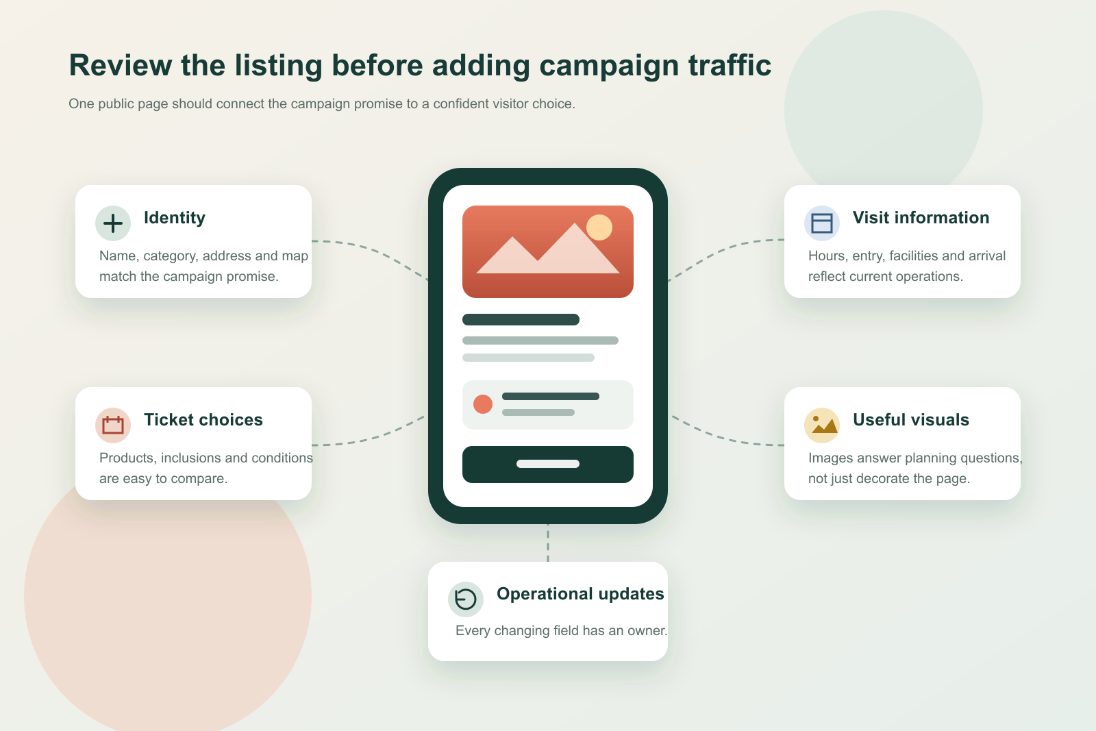
Audit what a traveller can understand in one minute
Begin with the public page, not the partner dashboard. Open the exact destination a campaign user will reach and read it as a first-time visitor on a mobile screen. Do not fill gaps with knowledge that only your internal team has.
Within the first minute, a traveller should be able to answer five questions:
Is this the attraction I meant to find?
Where is it, and when can I visit?
Which ticket or experience fits my party?
What must I bring, book or do before entry?
What will the visit actually feel like?
Record every answer as clear, unclear, conflicting or missing. The value of this exercise is not the score; it is the evidence. A team may discover that the hero image is attractive but the venue identity is ambiguous, or that ticket cards exist but their differences only make sense to an internal product manager.
Run the same test using the planned campaign route. If a campaign promotes a particular seasonal event, ticket package or visitor segment, follow that promise into the listing. The destination should make the relevant option easier to recognise, not force the traveller to start the research again.
Broader China travel and tourism marketing only works when the handoff feels continuous to the traveller. Inspiration and booking may happen on different surfaces, but the information architecture still needs to connect them.
Make the attraction unmistakable
Identity problems are easy for the brand team to overlook because the team already knows what it is looking at. A traveller may encounter an English name, a Chinese name, a location label, a parent resort and a particular ticket product in the same journey. If those elements are inconsistent, the listing can feel like a different offer from the campaign.
Check the public title, Chinese name, English name, category, address, map location, contact details and the way the attraction is described in the opening lines. Compare them with the campaign, the official website and current on-site signage. Keep wording consistent without forcing every surface into the same phrasing. The practical goal is to remove avoidable doubt about identity and location.
Pay particular attention to attractions inside larger destinations. A museum within a cultural district, a show inside a resort or a seasonal experience inside a theme park needs a clear relationship to the parent place. A traveller should not have to guess whether the ticket covers the wider venue, one zone or one timed activity.
Use stable naming for durable information, then give changing experiences their own precise labels. If a temporary event has a campaign name, make sure the listing language allows a Chinese reader to recognise the same event without depending on a literal translation. This is a content-localisation decision, not just a character-by-character naming exercise.
Turn ticket products into choices a traveller can compare
Ticket complexity is often where a campaign journey breaks. Attractions understand their own inventory, but travellers see a group of product cards with similar titles, different inclusions and conditions that may be spread across several screens.
Review every product that the campaign may expose. For each one, confirm that the title identifies the core experience and the intended visitor. Then check whether the page makes these elements clear where applicable:
what the ticket includes and excludes;
the visit date or validity period;
adult, child, senior, student or family conditions;
whether identification or supporting documents are required;
whether entry is immediate, timed or subject to another reservation step;
whether a physical ticket must be collected;
where and how redemption happens;
cancellation or refund conditions;
accessibility or companion requirements that materially affect the visit;
optional extras that cost more once the visitor arrives.
Current Trip.com product cards visibly distinguish conditions such as bookable date, cancellation, collection and audience eligibility. The exact options vary by attraction, product and partner arrangement. The editorial job is therefore not to invent a universal template. It is to remove ambiguity from the fields that actually apply to the attraction’s authorised products.
Avoid product names that only make sense in an internal inventory system. “Package B”, “standard admission plus” or a direct translation of an operational code does not help a traveller choose. Lead with the difference that changes the visit: duration, area, access method, included experience or visitor group.
This is also where Chinese content localisation and production should protect operational accuracy. Clear Chinese wording must not make a flexible condition sound guaranteed or make a restricted ticket sound universally valid.
Align hours, entry rules and on-site reality
Opening information is not one field. A useful listing may need to distinguish opening time, last ticket time, last admission, closing time, closed days, seasonal extensions and event-specific access. A single “open today” label cannot carry all of that meaning.
Current attraction pages may show date-specific opening windows, reservation information, admission rules and amenities. Those public fields should be checked against the attraction’s current operational source, not copied from last season’s campaign plan. If hours vary, say what varies and identify the reliable point of confirmation inside the approved listing workflow.
Entry rules deserve the same discipline. Travellers may need to know which identification is accepted, whether the booking name must match the visitor, whether children require an accompanying adult, or whether a separate reservation is needed after purchasing a ticket. The attraction should confirm the relevant facts with its own operations and distribution owners before localising them.
On-site details can remove practical hesitation. Transport arrival, entrance location, security checks, bag storage, stroller or wheelchair access, family facilities, language support, food options and weather exposure may matter more than another promotional adjective. Include only the facilities that are genuinely available, and distinguish complimentary services from paid or limited ones.
Do not turn the listing into an encyclopaedia. Prioritise information that changes the decision, prevents a failed visit or helps the traveller choose the right product. Link each changing fact to a named internal owner so it can be corrected quickly.
Use images to answer planning questions
An attraction listing needs visual appeal, but beauty alone is not enough. A traveller also wants evidence: what the entrance looks like, what the principal experience involves, how large or crowded a space may feel, whether children can participate and what distinguishes one ticketed option from another.
Build the image set around those decisions. A practical sequence might include an unmistakable exterior or entrance, the signature experience, a human-scale view of participation, a useful family or accessibility cue and a current seasonal feature. Remove obsolete event artwork, duplicate angles and images that exaggerate what a standard ticket includes.
Use owned photography or material that the attraction is authorised to distribute. Do not copy images from another listing, a creator post or a traveller review. Keep an internal record of ownership, date and usage boundaries, especially when campaign teams and distribution partners exchange assets.
Crop for the actual mobile presentation. Important details should survive a narrow card, while people, signage and architecture should not be cut in misleading ways. If text is embedded in an image, check that it remains readable and current; often the stronger choice is to place changeable information in editable listing copy instead.
Write highlights for a real visit
Promotional copy often describes an attraction as iconic, immersive or unforgettable without explaining why. Listing highlights should do the opposite: translate the brand promise into concrete features a traveller can picture and compare.
Start with the visit itself. What can the visitor see, do or experience? What makes the attraction different from other things to do in the destination? How much time should someone reasonably allow? Which visitor group is best served: family participation, cultural depth, panoramic views, entertainment, a particular exhibition or convenient access to several experiences?
Separate durable highlights from changeable programming. Architecture, location and a core collection may be stable. Shows, seasonal zones, temporary exhibitions and operating schedules need dates and owners. A campaign can feature the changeable layer, but the evergreen listing should not present it as permanent.
Traveller reviews can help identify where the official explanation is weak. Current Trip.com attraction pages place operational information alongside traveller feedback, including recent and photo reviews. Read recurring questions and misunderstandings as diagnostic evidence. If visitors repeatedly ask where to redeem a ticket or discover too late that an area costs extra, the listing may need clearer official information.
This is not permission to script, reward or manipulate reviews. Nor should a single complaint be treated as universal truth. Look for repeated, decision-relevant patterns and confirm the underlying fact with the operational owner before changing official copy.
Build one source of truth before localisation
International attractions often have several partially correct sources: the global website, a local distributor sheet, ticketing terms, an operations calendar, campaign copy and information held by guest-service teams. Translating whichever document is easiest creates contradictions.
Create a compact listing source of truth before rewriting the Chinese page. It should name the owner and last verification date for identity, products, price and inventory logic, hours, entry conditions, facilities, transport and current programming. Where a field is controlled by a partner or another internal system, record that boundary rather than pretending marketing can edit it directly.
The Chinese listing can then express the approved facts in the order a traveller needs them. This matters because localisation is partly prioritisation. A visitor deciding whether to book needs different information from a stakeholder approving a global brand brochure.
Keep the source record lightweight enough to maintain. A perfect document that no one updates is less useful than a short controlled record with real owners. When the campaign changes, update the source first, then reconcile the listing and campaign assets against it.
For a broader view of how a single attraction fits into a Chinese visitor journey, Lotus’s guide to China marketing for theme parks and family attractions covers discovery, planning and post-visit continuity. This article deliberately keeps the implementation boundary at the Ctrip page.
Run the campaign-link test on mobile
Do not approve the listing only from a partner dashboard or desktop preview. Use the exact public route planned for the campaign and test it on a mobile device under realistic conditions.
Check that the link resolves to the intended attraction and not a generic destination page, search result or different product. Confirm that the page loads in the expected language and market context. Follow the route from the campaign message to the relevant ticket, then stop before completing a transaction unless a controlled test purchase has been authorised.
During the test, record the number of decisions and surprises. Does the traveller need to reselect the city? Does the campaign describe an experience that is hard to find on the listing? Are ticket names truncated at the point where they differ? Does a change in currency, date or visitor type produce a condition the campaign failed to mention?
Test both a first-time visitor and a campaign-specific route. The first reveals whether the listing stands on its own. The second reveals whether the marketing promise and the product destination stay connected.
Resolve material conflicts before launch. If the relevant listing field cannot be changed, adjust the campaign destination or wording rather than sending traffic into an experience the team knows is confusing.
Set an update rhythm that matches operational change
Listing readiness is not a one-off editorial task. Attractions change hours, programmes, ticket inventory, access routes and on-site services. The review rhythm should reflect those changes rather than an arbitrary calendar.
Assign a standing owner for routine checks and a trigger-based path for urgent updates. Useful triggers include a seasonal-hours change, a new ticket product, an event opening or closing, a transport disruption, a facility change, a repeated visitor question or a campaign that introduces a new audience segment.
Where account access permits, use available content and transaction signals to decide what to inspect. Ctrip’s current content-centre surface describes operational categories such as exposure, views, interaction, orders, audience profile and platform trends. These signals can help teams identify where questions are emerging, but they do not explain performance by themselves and they do not guarantee future visibility.
Pair platform signals with support enquiries, campaign comments and on-site feedback. Use that combined evidence to make the next information decision: clarify a product, replace an obsolete image, surface a missing facility or correct a promise that operations cannot consistently deliver.
Use this readiness checklist before adding traffic
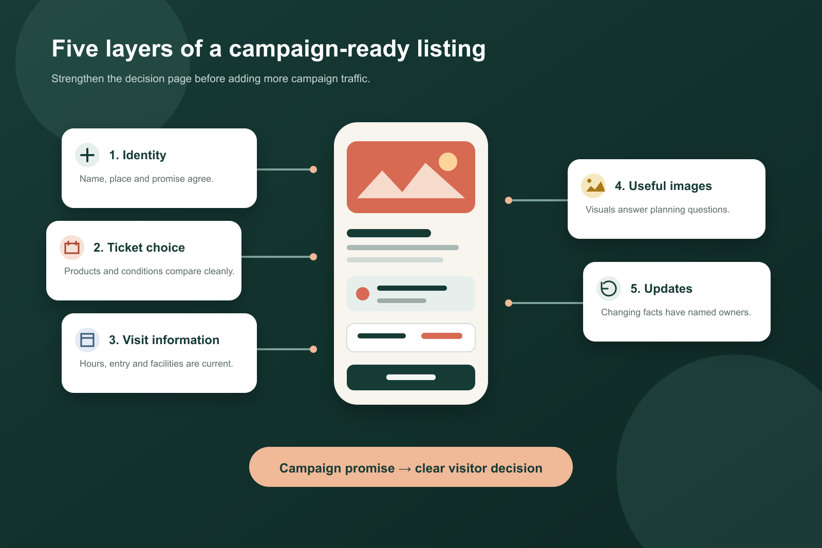
The listing is ready for campaign review when the team can evidence each of the following:
The public title, names, category, address and map location identify the intended attraction.
Campaign wording and listing wording describe the same experience.
Each promoted ticket has a traveller-facing name and clear inclusions.
Date, visitor-type, redemption, collection and cancellation conditions are accurate where applicable.
Opening, last-entry and seasonal information reflect current operations.
Admission rules and required documents are explained without overstatement.
Practical arrival, accessibility and facility information covers the decisions most likely to block a visit.
Images are current, authorised and useful on a mobile screen.
Highlights explain the experience rather than relying on generic praise.
Repeated traveller questions have been checked against official operational facts.
Each changing field has a named internal owner and verification date.
The exact campaign link reaches the intended listing and relevant product.
A mobile route test has found no unresolved contradiction that would materially affect a visit.
The team knows which events should trigger an immediate listing review.
Passing this checklist does not guarantee ranking, placement or bookings. It means the attraction has removed avoidable information gaps before paying to create more attention. That is a more responsible use of campaign budget and a better starting point for learning from real traveller behaviour.
Make the decision page worthy of the campaign
An international attraction can invest heavily in creative, media and partnerships, then lose momentum at the point where a traveller needs practical confidence. The fix is rarely more promotional language. It is a listing that connects the campaign promise to an accurate product, a recognisable visit and a clear next step.
Treat the Ctrip page as owned campaign infrastructure even when some controls sit with a platform or partner. Give its facts real owners, localise for the traveller’s decision, and test the public mobile route before launch. Then use changing questions and operational signals to keep it current.
If your team is preparing a China campaign and wants an experienced local view of the attraction listing, content and traveller journey, Lotus can help you identify the gaps that matter before additional traffic arrives.
